Yes. You read that correctly. Using the methods that I’ll be outlining in this post, I managed to grow the email subscription rate for WP Site Care by 1,075% in about a month. This isn’t going to be a sales pitch for some new WordPress plugin or marketing tool. Instead, it’s an exact breakdown of what I did and how you can do the same for your website.
WP Site Care has had an email list since the company started back in early 2013. When I came on board, I performed an internal audit of everything we were doing from a marketing standpoint. In doing this, I noticed that while there has been a steady increase in subscribers, the mailing list has never performed very well.
If you’ve been in the Internet marking world for any length of time, you know how important email marking is, so fixing this was a no-brainer for me. Using a few simple techniques, I turned things around and the list has been steadily growing faster every month since my changes were implemented.
 Now, I’m not going to tell you that there’s some magic bullet that you’ve been missing when it comes to growing your email list because I’d be lying. What I will tell you right now is that whatever you’re doing is probably wrong.
During my time running Audit WP, I evaluated the list growth tactics employed by 100s of bloggers and business owners. To my surprise, not a single person was building their list correctly. A few people were on the right track, but most were flat-out not even in the ball park.
So, how do you get massive email subscriber growth for your site?
Well, to be honest it’s really not that complicated. Let me break it down into a few simple steps that should work in almost any scenario regardless of what you’re trying to market on your website.
- Come up with an offer your visitors will be very interested in
- Offer it to them in a way they can’t ignore
- Test the offer until you get a response you’re comfortable with
That’s really it. Figure out what your customers want and give it to them. It’s strange to me that so many people fail miserably at this even though it’s painfully obvious. If you want people to sign up for your email list… you have to give them a GOOD reason.
Pro tip: Getting annoying updates from your newsletter delivered to my inbox is not a reason. Seriously. It’s not even close.
You need something concrete that will pique your visitor’s interest. There’s a million things someone browsing your website could be doing, so handing over their email address needs to sound like the best idea they’ve heard all day.
Sounds easy enough, right? Here’s how we did it for WP Site Care.
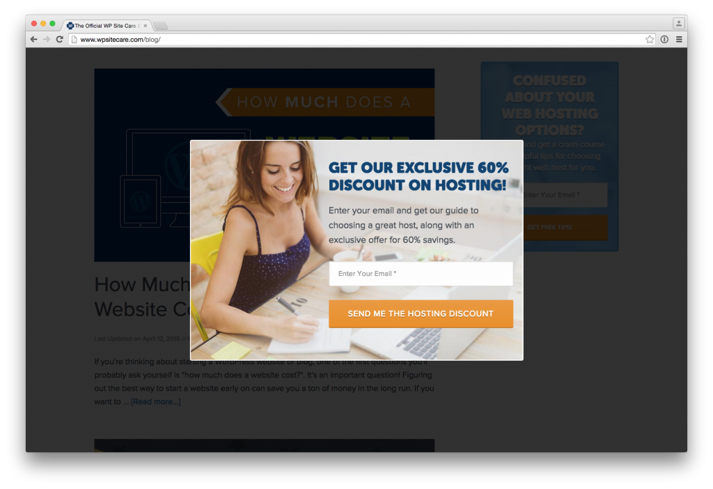
We get a lot of traffic related to WordPress hosting because we’ve covered the subject in depth on our blog. Because of this, we know a lot of our visitors are interested in finding the best WordPress hosting, so we created an exit-intent popup targeted directly at people who are looking for a hosting deal.
 This is typically the part of the post where I would start raving about how amazing the popup plugin we use is. Or how some marketing automation tool revolutionized our business and now we’re making 1000s of dollars a day by setting it and forgetting it.
I’d also cleverly insert cloaked affiliate links to the products I’m telling you to use, but I’m not going to do that; because that’s bullshit.
The truth is that how we made our popup doesn’t matter.
Why we made a popup and the intent behind it is the real key to growing your email list. There are lots of ways to get a popup like ours for your website, but none of them will give you exponential list growth by themselves.
The reason our popup works is because it grabs attention, it’s targeted at our audience, and it makes an offer that almost can’t be refused.
Think about it. If you were Googling around for how to host your WordPress website and were presented with an exclusive 60% discount, what would you do to get it? Would you drop your email into a friendly subscription box that tells you exactly what to expect? Yeah, that’s what I thought.
If you understand your audience, you don’t need the latest and greatest tools.
I know at this point I’ve probably lost some of you because I’m not providing a step-by-step guide on how to add a popup to your website. The thing is, the popup isn’t that important. The same thing could be achieved countless different ways.
You could publish a post with an irresistible offer and a big sign-up button smack dab in the middle of the content. You could trigger a redirect after a pre-set amount of time has passed on certain parts of your website. You could put an eye-catching image in your sidebar that’s impossible to ignore. I could go on, but I think you get the point.
Getting people’s attention shouldn’t be the hard part, but it seems to be the one that marketers focus on. The most challenging and important part is understanding who the people visiting your site are and what they need.
You should already have some idea about who these people are, but even if you don’t, you can get a lot of the information you’re going to need from Google Analytics.
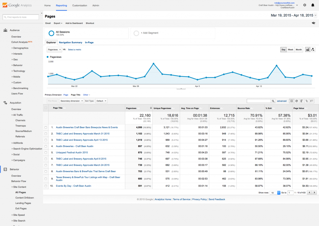 This is the All Pages screen within the Site Content section of the Behavior group in Google Analytics. For the purposes of this demonstration, I’m using my buddy Rich‘s site which is all about Austin’s craft beer scene.
If you look closely at the top 10 pages of his site over the last 6 months, it’s extremely obvious what people coming to his website are looking for. They want to know about all the beer events going on in Austin.
How about a real-world example to drive my point all the way home?
To give you a practical example of how anyone could implement the stuff I’m talking about on just about any website, let’s take a look at one of the highest traffic pages on the Craft Beer Austin site.
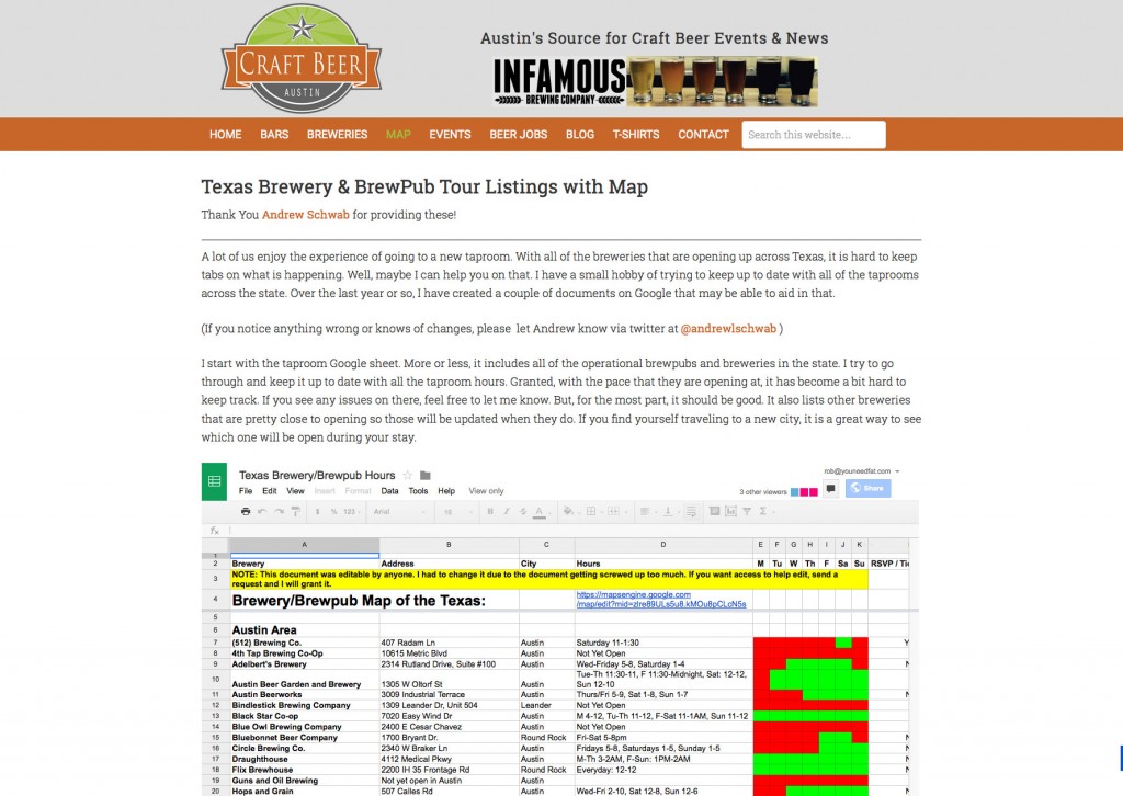 Now, there’s a lot of things about this page that I would change if it were my website, but that’s not really the point of this exercise. If Rich wants to start growing his email list at a rate similar to WP Site Care’s, he needs to add an email opt-in box directly to this page.
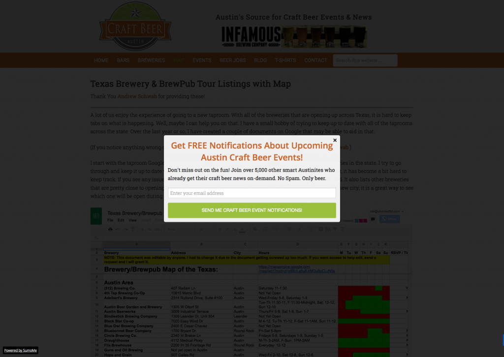
The offer needs to be strong and it needs to be related to craft beer events. Rich dabbles a bit in Internet marketing, so I’m not surprised that he’s already on the right track with this. If you stay on the page long enough, you’ll see the following offer:
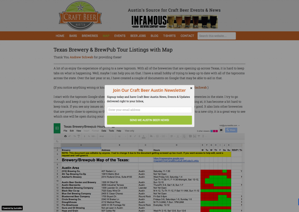 I don’t want to pick on Rich too much because I’m glad that he’s trying to grow his email list, but this is exactly the kind of half-hearted “I read a blog post about how great SumoMe is” attempt at list building that I keep seeing over and over again.
It’s true that this will probably get him some subscribers, but he’s not really making a compelling offer. Why do I want to join this newsletter? What’s in it for me? Is it going to cost me something? I think I’ll just click off and read the website at my leisure, thanks. Let’s see if we can improve this a bit, shall we?
 With just a few quick changes to the copy being used in the popup, we’ve made a much more compelling offer to Rich’s audience. Now it’s crystal clear what they’re signing up for and they know it won’t cost them anything.
I’ve also increased the contrast between the site and the popup and included a bit of social proof. By providing the number of people already signed up, you can make the list feel like an exclusive group. People like to be part of the “in crowd”, so anything you can do to make them feel that way is helpful.
If at all possible, I’d also try to score some exclusive discounts or perks with local bars and breweries that I could offer to my visitors as an extra incentive. Every little bit helps when you’re trying to snag email addresses.
These changes aren’t perfect by any stretch of the imagination, but it’s definitely a step in the right direction. In Rich’s case I’d probably also consider putting an opt-in directly on the page and maybe even hide the spreadsheet data behind an opt-in form.
It’s important that you take into account the context of your site and figure out the best plan of attack for your situation. Like I said before, there’s no magic bullet and you may have to try a few things before you hit your stride.
And now we’ve arrived at the pesky part… testing and improving.
I’m going to get this out of the way right now. I’m not a fan of a/b testing everything. Most of the time people waste a ton of time and effort testing things that don’t matter in ways that don’t make sense. In fact, an entire industry has cropped up around split testing over the last few years.
People hear about how much testing companies like Amazon and Apple do and think they need to test every element on every page of every website they ever touch. This is totally ridiculous. Just because Amazon is able to make test-driven experiments work on the scale they operate at doesn’t mean you can or should try to emulate them. You need to be realistic.
First of all, if you’re new to this whole marketing thing, you’re probably already going to be struggling with the basics that I’ve outlined in this post. The last thing you need to do is start stressing about what you should be testing. Until you’ve honed your skills, split testing will be the equivalent of trying to decide which turd has been polished most effectively.
 The important thing to remember is that you need to set goals that YOU feel comfortable with for YOUR website. Don’t get hung up on some arbitrary number like 1,075% or 50,000 subscribers.
Look at your current baseline and set a realistic goal. If you can meet it, great. Do it again. If you have trouble meeting your goals, start back at square one and try another idea. Eventually you’ll start to understand what your visitors respond to and at some point it might make sense to test one concept against another.
Until then, don’t fucking worry about it. You’ll be shocked at how much you can achieve when you don’t let yourself fall down rabbit holes like testing 50 different split testing plugins or trying to find out which background color conveys your brand messaging most effectively.
That’s pretty much everything. I hope this has been helpful.
I’ve been doing this stuff for a while and it’s always come somewhat naturally to me, so don’t expect to get explosive growth on your first try. I sure as hell didn’t. Just keep at it and don’t get discouraged or distracted. Persistence is what will pay off in the end.
Let me know what you think about all this in the comments and if you have any list growth strategies that have worked for you please share them. I’m always interested in hearing how other people are marketing things online, even if I usually end up doing things my own way. 😉
FIRST!
Also, congrats on the new blog. And thanks for making our email list not suck.
Is that popup script you made too specific to share with people?
It could probably be adapted to be shared, but it would take some explanation. It’s just included as part of the Site Care theme and uses a script called ouibounce.
Maybe I’ll write a follow-up post with the technical details next week.
We’ve been on the verge of doing a similar popup, but I’ve been hesitant mostly because (1) It feels cheap (my co-worker tells me: BUT IT WORKS!); and (2) Even if we get a lot more subscribes, are they actually QUALITY subscribers? Are they actually going to open your email and actually click through and actually buy stuff? Have you tested the list itself after all this growth? That’d be really great insight if you don’t mind sharing a bit.
The best thing I can tell you to do is give it a try and see how it works for you. It’s possible that your audience won’t respond well to a popup. I’ve seen it happen before.
If that’s the case, you just need to figure out another way to get their attention and make your offer. For us, the popup has worked well and our open rates have stayed well within acceptable limits. I can’t say the same will be true for you, but you’ll never know unless you give it a shot. 🙂
Great post Rob! And stellar use of non-Unsplash graphics.
Do you have any data on longevity of subscribers? As in: since what you are offering is a one-time delivery of a discount, do people subscribe, get discount, and then unsubscribe. Or does that not matter?
Thanks Daniel! An increased unsubscribe rate is something that we were pretty concerned about when we implemented this. So far, it hasn’t really been an issue. Our average unsubscribe rate rose about 0.5%.
There are always a few people who sign up only for the discount and then leave, but they’re definitely in the minority. It is pretty common to see a little higher unsubscribe rate when you use aggressive list building, but if you’re dialed in to your audience you usually won’t see any more than a slight bump.
It comes down to how effective you are at pushing out good content to the list on a regular basis. If your follow up emails are no good, you’re going to see more unsubs. If you keep things on point and make sure you’re always sending out stuff people want to read, you shouldn’t notice a huge difference in open rates or unsubscribes.
I like beer & e-mail lists.
Slow clap for all of this seriously. No bullshit, proper alt text for the images, this doesn’t get any better.